Modern life is hectic. Information is everywhere, which is inherently good. Consider how wonderful it is to be able to access the combined knowledge of humanity from your phone. Then consider how dangerous this is when it comes to the ability to distract you while you are moving.
Have you ever walked and looked at your phone instead of actively looking at your direction? We think this is harmless, but it is not. What is significantly worse is being distracted while driving. To that end, regulatory signs are designed with the user experience in mind: they are to convey their intended info clearly and concisely while also being noticeable.
What are Regulatory Signs?
A regulatory sign may trigger flashbacks to driver’s education classes, but it is important to know the purpose of such indicators: to provide information about road rules and traffic laws.
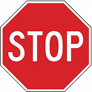
Consider the challenge sign designers face. They need to create an easily recognized shape that conveys important details clearly, and commands attention, all without distracting drivers. They also need to be distinct enough so as not to be confused with one another. Sign color and shape are the best ways to convey this critical information. The great thing is that these indicators tend to be rather uniform across the world, so if you visit Istanbul and do not know Turkish, you can still safely drive because the stop sign will still be a familiar red octagon.
Safety regulations are all around you. It is no accident that all school buses in the US and Canada are the same shade of yellow – research in the 1930s showed that the specific shade of yellow, officially know as National School Bus Glossy Yellow, was chosen because the lettering was most distinguishable against this color in the dawn semi-darkness. The peripheral vision of the human eye is much more sensitive to yellow than greens or reds.
Likewise, with safety in mind, all the colors of regulatory indicators are chosen to be accessible – specifically, they are meant to be seen by even those with some levels of visual impairment.
The Color of Signage is an Essential Indicator of the Information It Contains
Red signs – are exclusive for stop, yield, and prohibition indicators. 
White background signs – are regulatory; yellow is for caution or a general warning message.
Green – shows permitted traffic movements or directional guidance.
Fluorescent yellow or green – indicates pedestrian crossings and school zones.
Orange-colored signs – are used for warning and guidance in construction zones.
Blue signs – indicate road user services, tourist information, and evacuation routes.
Brown signs – serve as for guidance to sites of public recreation or cultural interest, like for National Historic locations.
Because the human eye is more sensitive to red than blue, safety-critical info is served on indicators that are red, orange, or yellow. Blue and brown regulatory signage is specifically colored because it contains info that is informational in purpose.
However, just like with color, contrast is also important. Contrast is how well the eye can distinguish the colors, and therefore the content of the indicators. Have you ever wondered why signs on the interstates have that dark green color? Research demonstrates that lettering at night is most visible when contrasted with that color. The reflective white on green color contrast is optimally chosen for being the most visible against white headlights at night.
Sign shapes also convey useful information to drivers
Traffic regulations – are conveyed in regulatory signage that is rectangular with the longer direction vertical or square.
Octagon shaped signs – are only used for stop, and inverted triangles are reserved for yielding.
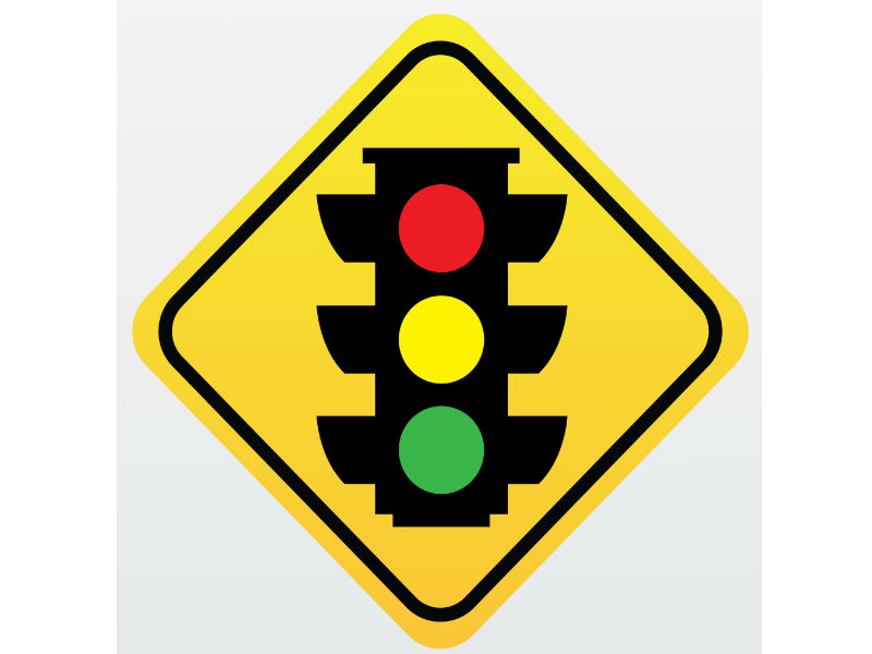
Diamond-shaped signs – are used for warning signs. Rectangular signage with the longer direction horizontal provide guidance information.
Pentagons – indicate school zones, although it might be more recognizable as a “house” than the typical geometric pentagon shaped signs.
Circular signs – always warn of a railroad crossing ahead while the crossing itself is denoted by an “X” shape.
By having both colors and shapes used in tandem to convey details to drivers clearly, there is more information given and a higher chance of the sign’s intended message being both transmitted and correctly interpreted.
A guide to all the regulatory signs that can be found across the United States is here.
Most Safety Equipment is Passive
Passive safety equipment is necessary because you need to see and react to the information being displayed to you.
Traffic cones – are commonly used to achieve this as they are highly visible and possess a unique shape, but they will do nothing to prevent you from running over them by accident.
The tall, cylindrical devices (delineators) – are even better at guiding the flow of traffic. They are more durable than your standard cones and can be impact-resistant and also be used to display road signage.
Even the big barrel-sized orange channelizing drums – are merely passive safety devices. Yes, they are large and can be sand-filled, but they will not stop a moving vehicle.
This is why you always see larger safety equipment, like trailer mounted message boards or arrow boards. These indicators are meant to be very visible and will display details about route detours or warn of road closures, be they for maintenance or holiday parades. These indicators, often solar-powered, are very durable and a key component in informing drivers about unsafe conditions ahead. This is why they are so heavily regulated. Job safety is paramount for construction workers as the conditions they work in are inherently dangerous.
Positive Protection
There are attenuators, which provide positive protection for construction workers in the case a distracted driver fails to comply with the posted signs. Positive protection, unlike passive protection, provides actual physical barriers designed to slow down and stop moving vehicles. Such barriers need to be massive – literally, they need to have a lot of mass. Such attenuators can be mounted to the backs of trucks, but they are most often filled with sand or water. Designed to deform in a collision, these attenuators are much safer than your traditional concrete Jersey barriers because they absorb and disperse the energy of a collision rather than reflect it.
Final thoughts on Regulatory Signs
A sign (see what I did there?) of doing a good job is not knowing that anything was done at all. It is very likely that you have never consciously noted how reds, yellows, and oranges are inherently more visible at night or in low-light conditions than blues. Yet the color and even the shape of regulatory signage subconsciously and consciously display vital information in the most concise and unambiguous manner.
This makes everyone safer while driving, and safety is always a high priority. Driving is inherently dangerous because the laws of physics are a cruel mistress. Heavy things moving at speed have a lot of energy, which can easily damage and injure others.
Worksafe Traffic Control Industries has all the essential materials, equipment, and signage required to facilitate safety at any location. With equipment available to rent or purchase, and up to state safety guidelines, trust Worksafe TCI with your safety needs.


