A strong business sign design does more than display a company name. It attracts attention, communicates value, builds trust, and moves people to take action. Whether a sign is placed outside a storefront, along a roadway, at a construction site, inside a commercial property, or near a municipal facility, it has only a few seconds to make an impression. That small window of time is exactly why thoughtful design matters. A sign that is hard to read, poorly placed, visually cluttered, or disconnected from the audience can easily be ignored. A sign that is clear, strategic, and built for its environment can become one of the most effective marketing and communication tools a business owns.
For companies, contractors, municipalities, property managers, and organizations that rely on signage to inform, direct, warn, advertise, or convert, the goal should never be “just put something up.” The goal should be to create a sign that works. That means every design decision, from size and color to placement and messaging, should support a specific outcome.
Start With the Purpose of the Sign
Before choosing colors, fonts, materials, or layouts, define what the sign needs to accomplish. A sign without a clear purpose often becomes too busy because it tries to say everything at once. Effective signage starts with one primary goal.
Your sign may be designed to:
- Drive foot traffic into a business
- Promote a specific product, service, or offer
- Help visitors navigate a property
- Improve safety in a work zone or parking area
- Communicate rules, warnings, or instructions
- Support brand recognition
- Provide real-time traffic or route information
- Direct drivers, pedestrians, or workers efficiently
Once the purpose is clear, every design choice becomes easier. A retail sign meant to attract customers may need bold branding and a strong call to action. A highway or construction sign may need to prioritize visibility, compliance, durability, and immediate comprehension. A municipal or commercial directional sign may need to communicate quickly while maintaining a professional appearance.
Know Who Needs to Read It
A sign should be designed for the people who will actually see it. That may sound obvious, but many signs fail because they are designed from the business owner’s perspective instead of the audience’s perspective.
Consider who the sign is meant to reach:
- Drivers moving at highway speed
- Pedestrians walking past a storefront
- Construction workers on an active jobsite
- Customers entering a commercial building
- Delivery drivers looking for the correct entrance
- Municipal workers managing traffic flow
- Event attendees navigating a temporary route
Each audience has different needs. Drivers need fast, readable information. Pedestrians can absorb more detail, but still need clarity. Workers in high-risk environments need signage that is visible, direct, and placed where it can support safer decisions. Customers need signs that reduce confusion and make the next step obvious.
The more you understand the audience, the more effective the sign becomes.
Keep the Message Simple
One of the biggest mistakes in sign design is trying to include too much information. A sign is not a brochure, a web page, or a sales presentation. It is a quick communication tool. The message should be short, direct, and easy to understand at a glance.
A strong sign usually answers one or more of these questions:
- Who are you?
- What do you offer?
- Where should someone go?
- What should someone do next?
- What does someone need to know immediately?
For commercial signs, a concise message like “Now Leasing,” “Open 24 Hours,” “Custom Signs Available,” or “Entrance on Right” is often more effective than a long explanation. For traffic and work zone signs, clarity is even more important. Drivers and workers need to understand the message instantly, especially when conditions change quickly.
If the message cannot be understood in a few seconds, it should be shortened, simplified, or supported by additional signage.
Prioritize Readability Above Everything Else
A sign can look attractive and still fail if people cannot read it. Readability is one of the most important factors in conversion because it determines whether the message is received at all.
To improve readability:
- Use clean, legible fonts
- Avoid overly decorative lettering
- Make the most important words largest
- Create strong contrast between text and background
- Leave enough space around text and graphics
- Use uppercase and lowercase text when appropriate
- Avoid crowding the sign with too many design elements
Distance and speed also matter. A sign viewed from a car needs larger lettering than a sign viewed from a sidewalk. A message sign on a roadway needs to account for reaction time, traffic flow, weather, lighting, and visibility conditions. A business sign near a busy street may need bolder typography and simpler wording than one inside a lobby or reception area.
When in doubt, choose clarity over decoration.
Use Color Strategically
Color plays a major role in how a sign is noticed and understood. The right color palette can reinforce branding, improve visibility, and guide the viewer’s attention. The wrong palette can make the sign hard to read or visually confusing.
For business signs, brand colors are important, but they should still support readability. A low-contrast color combination may look good on a computer screen but perform poorly outdoors. For safety, traffic, highway, and construction signage, color choices may also need to follow specific standards or expectations so that viewers understand the message quickly.
Good color use should:
- Create contrast
- Support the message
- Match the environment
- Reinforce brand identity
- Avoid visual clutter
- Improve visibility in daylight, darkness, or poor weather
A bright sign can attract attention, but brightness alone does not make it effective. Color should always serve the purpose of the sign.
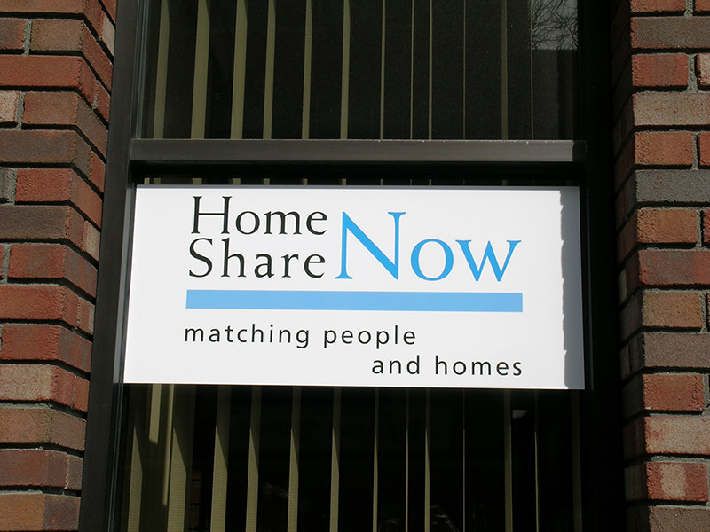
Make Branding Clear but Not Overwhelming
For commercial signage, branding is essential. Your sign should help people remember your organization and recognize it again later. However, branding should not overpower the core message.
A strong branded sign may include:
- Company name
- Logo
- Brand colors
- Tagline or short value statement
- Website or phone number
- Clear call to action
The key is balance. A logo should be visible, but not so large that it crowds out the message. A tagline can be helpful, but only if it is short and meaningful. Contact information can support conversion, but too many contact options can make the sign feel cluttered.
For a sign to convert, it must be both recognizable and useful.
Design for the Environment
The setting of a sign should heavily influence its design. A sign placed outdoors in New England, for example, may need to withstand snow, rain, wind, salt, sunlight, and changing temperatures. A sign used in a highway work zone may need to remain visible in fast-moving traffic and changing conditions. A sign used at a commercial property may need to look polished while guiding visitors efficiently.
Environmental considerations include:
- Viewing distance
- Lighting conditions
- Weather exposure
- Traffic speed
- Mounting location
- Background visual noise
- Seasonal conditions
- Local codes or regulatory requirements
- Temporary versus permanent use
A sign that performs well indoors may not work outdoors. A sign that works on a slow city street may not work on a highway. A sign that looks good during the day may need reflective materials, illumination, or electronic messaging to remain effective at night.
Effective sign design always accounts for where and how the sign will be used.
Choose the Right Materials
Materials affect appearance, durability, maintenance, and long-term value. A temporary construction sign has different requirements than a permanent municipal sign. A commercial storefront sign has different needs than a portable message board or traffic control device.
The right material should match the purpose, location, expected lifespan, and exposure conditions of the sign. In many cases, investing in higher-quality materials can reduce replacement costs and improve performance over time.
When selecting materials, consider:
- Indoor or outdoor use
- Expected duration of use
- Weather resistance
- Reflectivity
- Impact resistance
- Maintenance needs
- Portability
- Regulatory standards
- Installation requirements
For organizations that need signage for municipal, highway, construction, and commercial applications, material selection is not just about appearance. It is about safety, reliability, and long-term performance.
Use Visual Hierarchy to Guide the Eye
Visual hierarchy is the order in which people notice information on a sign. A well-designed sign guides the viewer naturally from the most important element to the next step.
For example, a commercial sign may use this hierarchy:
- Main message or business name
- Supporting benefit or service
- Directional cue or call to action
- Contact information
A work zone or traffic sign may use a different hierarchy:
- Warning or condition
- Required action
- Distance, lane, route, or timing information
- Supporting directional details
Without hierarchy, everything competes for attention. When everything is emphasized, nothing stands out. Strong hierarchy makes the sign easier to understand and more likely to generate the desired response.
Include a Clear Call to Action
A sign that converts should tell people what to do next. The call to action does not need to be complicated. It simply needs to be obvious.
Examples include:
- Call Today
- Visit Our Showroom
- Enter Here
- Request a Quote
- Follow Detour
- Slow Down
- Merge Left
- Scan for Details
- Rent Equipment Now
- Contact Our Team
For business signage, the call to action can help turn awareness into inquiries, visits, calls, or purchases. For traffic and safety signage, the call to action can help influence behavior, improve flow, and reduce confusion.
A sign without a next step may inform, but a sign with a clear next step is more likely to convert.
Do Not Ignore Placement
Even the best sign design will underperform if the sign is placed in the wrong location. Placement determines visibility, timing, and usefulness.
Before installation, evaluate:
- Where viewers will approach from
- How much time they will have to read the sign
- Whether anything blocks the view
- Whether the sign is positioned at decision points
- Whether lighting changes throughout the day
- Whether additional signs are needed for reinforcement
- Whether the sign meets local or project-specific requirements
Placement is especially important for roadway, construction, and traffic control signage. Signs must be positioned where they support safe, timely decision-making. For commercial environments, signs should be located where they naturally guide customers toward action.
Consider Technology for Dynamic Messaging
Not every sign needs to be static. In many traffic, construction, municipal, and commercial settings, conditions change throughout the day or over the course of a project. Dynamic signage and smart traffic technologies can help communicate real-time information when static signs are not enough.
Examples include:
- Message signs
- Arrow boards
- Temporary traffic signals
- Trailer-mounted video cameras
- Queue detection systems
- Speed signs
- Microwave detection technologies
- Real-time traffic information systems
- Dynamic lane merge systems
- Conflict warning systems
- Alternative route information systems
These tools can be especially valuable for work zones, roadway projects, incident management, and traffic flow challenges. When signs can respond to current conditions, they become more than visual markers. They become active communication systems.
Test the Sign Before Final Production
Before a sign is produced, installed, or deployed, it should be reviewed from the viewer’s perspective. This step can prevent costly mistakes and improve results.
Ask these questions:
- Can the main message be understood quickly?
- Is the text large enough?
- Is the contrast strong enough?
- Is the sign too cluttered?
- Does the design match the intended environment?
- Is the call to action clear?
- Is the sign compliant with relevant standards?
- Will it remain visible in real-world conditions?
- Does it support the intended business or safety outcome?
For larger projects, complex traffic control applications, or smart work zone deployments, working with an experienced signage and traffic safety partner can help ensure the design, equipment, placement, and implementation all work together.
FAQ
What makes a business sign effective?
An effective business sign is easy to read, visually clear, placed in the right location, and designed around a specific goal. It should communicate the most important message quickly and guide the viewer toward a clear next step.
How many words should be on a sign?
Most signs should use as few words as possible. The ideal word count depends on viewing distance and speed, but shorter messages are generally easier to read and remember. A sign viewed from a moving vehicle should be especially concise.
What colors work best for business signs?
The best colors are those that provide strong contrast, support brand recognition, and remain visible in the sign’s environment. High contrast combinations usually perform better than low contrast designs, especially outdoors or from a distance.
Why is sign placement so important?
Placement affects whether people can see, read, and act on the sign at the right moment. A well-designed sign placed too late, too low, too far away, or behind an obstruction may fail to deliver results.
Should a sign include a phone number or website?
Yes, if the sign’s purpose is to generate leads, calls, visits, or inquiries. However, contact information should be simple and easy to remember. Avoid adding too many details that could make the sign look crowded.
When should a business use digital or message signs?
Digital or message signs are useful when information changes frequently or needs to respond to real-time conditions. They are especially valuable for work zones, traffic updates, detours, events, and safety communications.
How can signage improve safety?
Clear signage helps people understand hazards, directions, speed changes, lane shifts, route updates, and work zone conditions. This can reduce confusion, support better decisions, and help protect workers, drivers, pedestrians, and customers.
Call Always On Time Signs for Signs and Smart Traffic Safety Solutions
A sign that converts is never an accident. It is the result of clear messaging, strategic design, durable materials, proper placement, and expert implementation. Whether your organization needs municipal signs, highway signs, construction signs, commercial signs, traffic control devices, or advanced smart work zone solutions, we are ready to help.
For more than twenty-five years, we have provided smart traffic safety solutions throughout New England. As a manufacturer of municipal, highway, construction, and commercial signs, as well as a reseller of traffic control devices and equipment, we offer both sales and rental options to meet the needs of projects large and small.
We maintain a large rental fleet that includes message signs, arrow boards, traffic signals, trailer-mounted video cameras, queue detection systems, speed signs, and microwave technologies. Our team specializes in smart work zone and real-time traffic solutions, including real-time traffic information, queue warning systems, dynamic lane merging, conflict warnings, and alternative route information.
From the design phase to implementation and deployment, we provide the full package. Our team also offers short- and long-term 24/7 maintenance services and equipment repair to keep projects moving and safety systems performing.
When your project calls for dependable signs, traffic control equipment, smart work zone technology, or real-time traffic solutions, we are the ones to call. Contact us today to discuss your project needs, request sales or rental options, and get expert support from a team committed to safety, service, and smart solutions.