When most people think of a warning sign, the classic yellow diamond with an exclamation point comes to mind. It’s simple, recognizable, and universally associated with caution. But there’s far more happening behind the scenes than most drivers — or even pedestrians — realize. Every shape, color, and symbol used on a sign is carefully chosen to influence behavior, convey urgency, and improve safety outcomes.
At Worksafe Traffic Control Industries, we specialize in more than just manufacturing compliant signs. We understand the psychology that makes a warning sign effective and how design choices directly affect safety. In this blog, we’ll take you behind the exclamation point and explore how shape, color, and symbol psychology work together to create warning signs that people don’t just see — but instantly understand.
Why Warning Signs Are More Than Just Messages
Signs are more than metal sheets with words or graphics — they’re behavioral tools. A well-designed warning sign can make a distracted driver slow down, alert a construction worker of danger, or guide a pedestrian away from hazards. Poorly designed signs, on the other hand, risk being ignored or misunderstood.
The effectiveness of any warning sign depends on three interconnected elements:
- Shape – instantly categorizes the type of message.
- Color – triggers instinctive emotional responses.
- Symbols – provide clarity, especially in split-second situations.
When these elements work together, safety communication becomes seamless and nearly universal.
The Psychology of Shapes in Warning Signs
Shape is often the very first feature we recognize. Long before a driver reads the words on a sign, their brain processes its outline. That’s why the MUTCD (Manual on Uniform Traffic Control Devices) has standardized shapes for specific messages.
- Diamond Shape: Universally recognized as a warning. These are used to alert drivers to upcoming conditions such as sharp curves, merging lanes, or pedestrian crossings.
- Octagon Shape: Reserved exclusively for the “STOP” sign. Its uniqueness ensures instant recognition.
- Triangle Shape (point down): Always used for yielding drivers to slow down and give right-of-way.
- Rectangle/Vertical Shape: Typically informational, not warnings, but essential for context.
By standardizing shape, even someone who doesn’t speak the language or can’t read quickly will know whether they’re being asked to stop, yield, or pay caution.
Color Psychology in Warning Signs
Color is another critical component of sign effectiveness. Humans instinctively associate different colors with certain actions and emotions, and traffic engineers use this to their advantage.
- Yellow: The universal color for caution. A yellow warning sign grabs attention without causing panic, telling drivers to prepare for changing conditions.
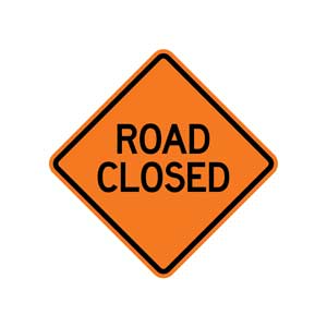
- Orange: Reserved for construction and temporary conditions. The bright hue communicates urgency and heightened awareness.
- Red: Demands immediate action — stop, do not enter, or wrong way. Red leaves no room for hesitation.
- Green: Used for direction and permission. While not a warning, it sets a tone of guidance.
- Blue: Indicates services or information, not hazards, but still plays a vital role in helping drivers orient themselves.
- Fluorescent Yellow Green: Specifically for pedestrian, school, and bicycle crossings, as it is more visible in low-light conditions.
Each color is chosen with purpose, leveraging instinctive human reactions to create clear, reliable communication.
The Power of Symbols Over Words
Words are powerful, but symbols can transcend language barriers and cognitive delays. Think about it: if a driver has only a few seconds to process a warning sign, a well-designed symbol can convey the message instantly.
- Curved Arrow: Instantly tells drivers a sharp turn is coming.
- Deer Icon: Warns of wildlife crossing.
- Children Silhouette: Indicates school zones or playground areas.
- Slippery Car Graphic: Warns of icy or slick conditions.
Symbols work on both conscious and subconscious levels, ensuring that even drivers unfamiliar with the local language or rules can make safe decisions.
Combining Shape, Color, and Symbols for Maximum Impact
An effective warning sign isn’t about using one psychological tool — it’s about layering them. A yellow diamond with a clear, universally understood symbol packs maximum clarity. Add reflective sheeting to improve nighttime visibility, and you have a tool that works around the clock.
For example:
- A yellow diamond with a deer symbol tells a driver: “Caution: Deer may be on the road.”
- An orange diamond with a worker symbol tells drivers: “Construction ahead—slow down.”
- A fluorescent yellow-green diamond with pedestrian figures instantly signals the need to yield to people crossing.
This layered approach ensures that no matter the driver’s speed, background, or level of distraction, the message is understood.
Reflectivity: The Invisible Hero of Warning Signs
A sign is only effective if it can be seen. Modern warning signs are manufactured with advanced reflective sheeting that bounces light from headlights back toward drivers. This technology makes signs visible from greater distances, even in complete darkness.
Reflectivity levels are categorized by grades (engineer-grade, high-intensity, and diamond-grade). High-risk areas, such as highways or school zones, often require higher reflectivity to ensure visibility in all weather conditions.
Cultural and Global Perspectives on Warning Signs
Interestingly, while the U.S. has standardized its signage under MUTCD, many global systems rely even more heavily on symbols and color. For example:
- In Europe, triangular signs often serve as warnings instead of diamonds.
- Japan uses unique colors, like blue for warnings in some contexts.
- In developing countries, hand-painted signs may still be common, creating challenges for consistency.
Despite differences, the psychology of shape and color remains universal—our brains process these cues in similar ways, regardless of geography.
Common Mistakes That Reduce Effectiveness
Even the best-designed warning sign can fail if not implemented correctly. Common mistakes include:
- Poor Placement: If a sign is hidden by vegetation or placed too close to the hazard, drivers may not have enough time to react.
- Cluttered Signage: Too many signs in one place overwhelm drivers and reduces comprehension.
- Non-Standard Shapes or Colors: Deviating from MUTCD guidelines confuses drivers.
- Faded Reflectivity: Signs that lose their brightness over time stop being effective at night.
Routine inspections and replacements are essential to maintaining safety.
How Warning Signs Protect Workers and Communities
Warning signs don’t just protect drivers — they protect the people working on or near roadways as well. Construction crews, utility workers, and first responders all rely on drivers obeying signage for their safety. In many states, ignoring an orange construction warning sign doubles your fines. These laws emphasize just how critical these visual cues are in preventing accidents.
Communities also benefit from effective signage, which reduces collisions, keeps traffic flowing smoothly, and builds public trust in local infrastructure management.
The Future of Warning Sign Design
Technology is shaping the next generation of traffic control. Beyond traditional reflective sheeting, we’re seeing:
- Digital Dynamic Signs: Capable of changing messages depending on conditions.
- Solar-Powered Flashing Signs: Increasing visibility in high-risk zones.
- Vehicle-to-Infrastructure Communication: Future vehicles may receive digital alerts synced with physical signs.
- Augmented Reality Integration: Navigation apps could highlight real-world signs in real-time on driver displays.
While the classic exclamation point sign remains iconic, its role will continue to evolve as technology creates new layers of safety.
Why Worksafe Traffic Control Industries Is Your Trusted Partner
At Worksafe Traffic Control Industries, we don’t just make signs — we make safety solutions. Every warning sign we design, and manufacture is built to meet MUTCD standards, crafted with durable materials, and optimized for visibility and effectiveness.
We understand that behind every sign is a responsibility: protecting drivers, pedestrians, and workers. That’s why we invest in the latest materials, stay ahead of regulatory updates, and work closely with agencies to ensure every sign we provide meets the highest safety standards. Whether you need standard diamond-shaped warnings, reflective pedestrian signs, or customized solutions for unique hazards, we deliver with precision and care.
Designing Safer Roads Through Smarter Signs
The next time you pass a yellow diamond or an orange construction warning sign, remember it’s more than just a piece of reflective material. It’s a carefully crafted safety tool designed with psychology, engineering, and decades of research behind it.
Effective warning signs blend shape, color, and symbols to communicate instantly and universally, helping prevent accidents and save lives. As technology advances, these tools will only become smarter, more visible, and more effective — but their mission remains the same: to keep people safe.
At Worksafe Traffic Control Industries, we’re proud to be part of that mission. With our expertise in manufacturing compliant, high-quality signage, we’re helping communities across the country create safer roads and work zones. If your organization is ready to upgrade signage, improve visibility, or explore innovative traffic control solutions, visit us at Worksafe Traffic Control Industries. Together, we can design roads that are not only safer but smarter—one sign at a time.